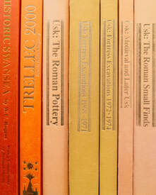
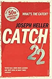
 Why do bookstore chains have big displays of book just inside their doors, showing the covers of the books that they are trying to sell that week? Firstly, the publishers are probably paying for the space that the display is taking up. But, more importantly, it is about the only place in a bookstore where it is possible to display the books so that the cover can be shown off. In the bookshelves themselves only the spines can be seen, with the odd book being turned “face outward” to show the front cover. Again, the publisher is probably paying to use that extra space.  There is an old saying amongst chefs that the first taste of a dish is with the eyes. Which is why chefs take so much care over the presentation of the food. It is sometimes a work of art in itself. "It LOOKS delicious." is something most of us have said in our time. And exactly the same rule applies to books. The first taste is with the eyes and the taster is the cover of the book. But instead of saying "It looks delicious" we say "It looks interesting". Cover design is something we have blogged about in the past, but we came across a book recently that reminded us of the importance of getting the cover right. Let me say up front that the book itself was excellent. It wasn’t published by us (more’s the pity), but we are happy to compliment the author on a job well done. One of our authors had been sent the book to review it, which is why he knew what it was about. We only became involved when the reviewer asked our opinion on the cover – which gave rise to this blog.  Just because a cover is artistic, it doesn't make it a good cover. Just because a cover is artistic, it doesn't make it a good cover. here was nothing wrong with the cover in artistic terms. The problem was that it didn’t say anything about the book. From the imagery it used, it wasn’t possible to know what genre the book was written in. The title didn’t tell us either. In a recent Tweet an author showed three potential covers for her latest book and asked followers which they preferred. I thought they all had a very dated, 1950s/60s, look about them and none of them excited my interest, despite the book being in a genre I read. I Tweeted back to say as much. She probably didn’t like the feedback, but better for the author to get it now than in several weeks’ time after the book has been published. The cover is the first thing a reader sees, regardless of whether it is a bookstore or on-line. The only place a cover isn’t required to make an impact is in a library, where all the books are displayed spine outwards, so only the title and the author’s name are visible.  "Don't judge a book by its spine." "Don't judge a book by its spine." The quote from George Eliot (1819-1880), “Don’t judge a book by its cover” is actually a misquote. What she actually said was “Don’t judge a book by its spine”. There are pretty obvious reasons why that version is true. But readers constantly judge books by their covers. It is why publishers spend so much money on cover designs. So, the cover and the title combined must tell the reader everything they need to know about genre, so the reader knows that it is the sort of book they like to read. If that is the case, they will then read the blurb, or the “look inside” portion, or both, and the reader is well on the way to buying the book. If that initial impact isn’t made, the reader will move on to the next book on the shelf, or they will scroll on by to the next book in the search results.  Joseph Heller's classic was already well known by the time this cover was used. Joseph Heller's classic was already well known by the time this cover was used. Authors choose their book titles for many reasons, and they don’t always say what genre the book is. From the title “Catch-22” you wouldn’t guess that the book was a satire on the way the United States Army Air Corp operated during World War II. It is more likely to suggest a book about baseball or cricket. The real genre only becomes apparent when you read the book. I’m sure that you can all think of other book titles that don’t suggest the genre of the book. Sometimes it is possible to guess because you know what sort of books are written by a particular author, but that isn’t a hard and fast rule either, because some authors write in multiple genres. But if it is an author’s first book, the reader has no idea what genre they write in. So, if the book’s title doesn’t suggest the genre and the author’s name isn’t familiar, then the book’s cover has to do a lot of work for the author if they want to capture the attention of a reader.  A lack of distinguishing features A lack of distinguishing features We went looking for other titles by the same author and, by accident, came across another problem. The book was the second in a series but the cover of the first book was so similar to that of the second that it is bound to create confusion for the reader. Our memories work far better with visual images than they do with text – and that is where the problem lay. With the exception of some minor differences in background colour, the cover of the second book was identical to the cover of the first book. The only major indication that the two books were different were the titles. Given what I have said about visual imagery taking precedence over text, readers are likely to recognise the cover image from the first book and think they have read the second book when they haven’t. If they have enjoyed the first book and would be prepared to buy the second book without knowing anything else about it, they might not buy for that reason. That’s a guaranteed sale that has been lost, because the cover caused confusion.  We can guess that the author was trying to establish a “brand identity” for the series and there is nothing wrong with that. Most authors (or publishers) of book series try to establish a brand identity for them. But readers must be able to identify individual books in a series at first glance, while also recognising the branding. The way the author (or their publisher) had done it in this case it wasn’t really possible to see that the two books were different. If a reader is asking themselves “Have I read this book before?” then they aren’t going to buy the book if they are in any doubt. They may not decide to read the book’s blurb to find out if they have read it, they may simply move on along the bookshelf or scroll through the search results and that is a lost sale. The above image of three covers from novels in Bernard Cornwell’s “Sharpe” series shows how a brand identity can be achieved, through a combination of layout, font selection and visual imagery.
I could go on about selecting the right fonts to suit the genre (the Sharpe covers provide a good example), but those sorts of refinements are secondary to the visual impact of the cover art. So, the two things we hope you will take away from this blog, if you are self-publishing your book: 1. Make sure your book cover makes it clear what genre the book is written in. 2. Make sure the reader can distinguish between successive books in a series. And if you are fortunate enough to have a publisher, make sure your publisher has addressed those two issues to your satisfaction before you sign off on the cover design. If in doubt, take some time to search through the listings of books, especially best-sellers, written in the same genre as yours to see what other authors/publishers have done with the covers. There is no shame in imitation (only in in direct copying). If you have enjoyed this blog, or found it informative, then make sure you don’t miss future editions. Just click on the button below to sign up for our newsletter. We’ll even send you a free ebook for doing so.
0 Comments
Leave a Reply. |
AuthorThis blog is compiled and curated by the Selfishgenie publishing team. Archives
June 2025
|

 RSS Feed